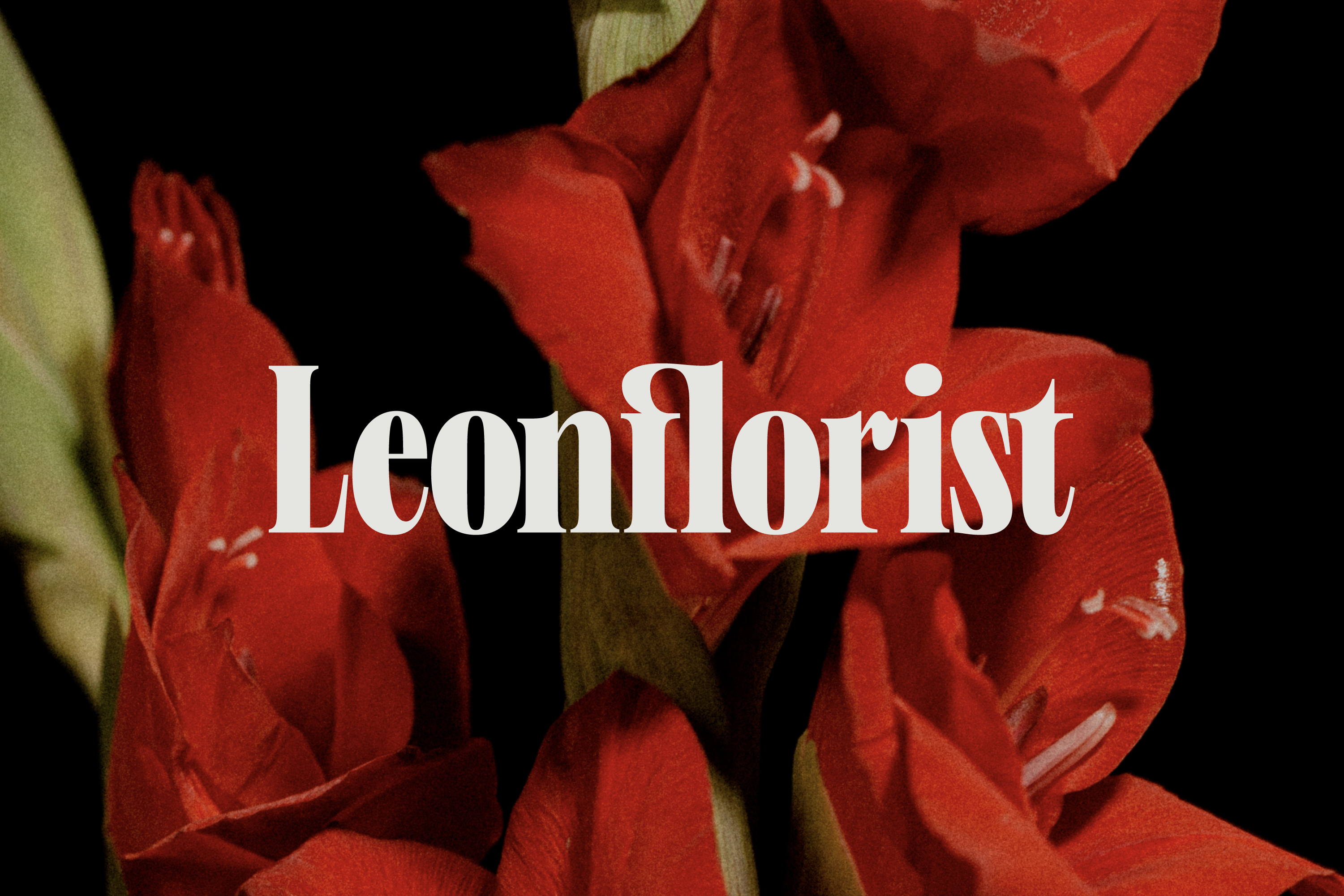
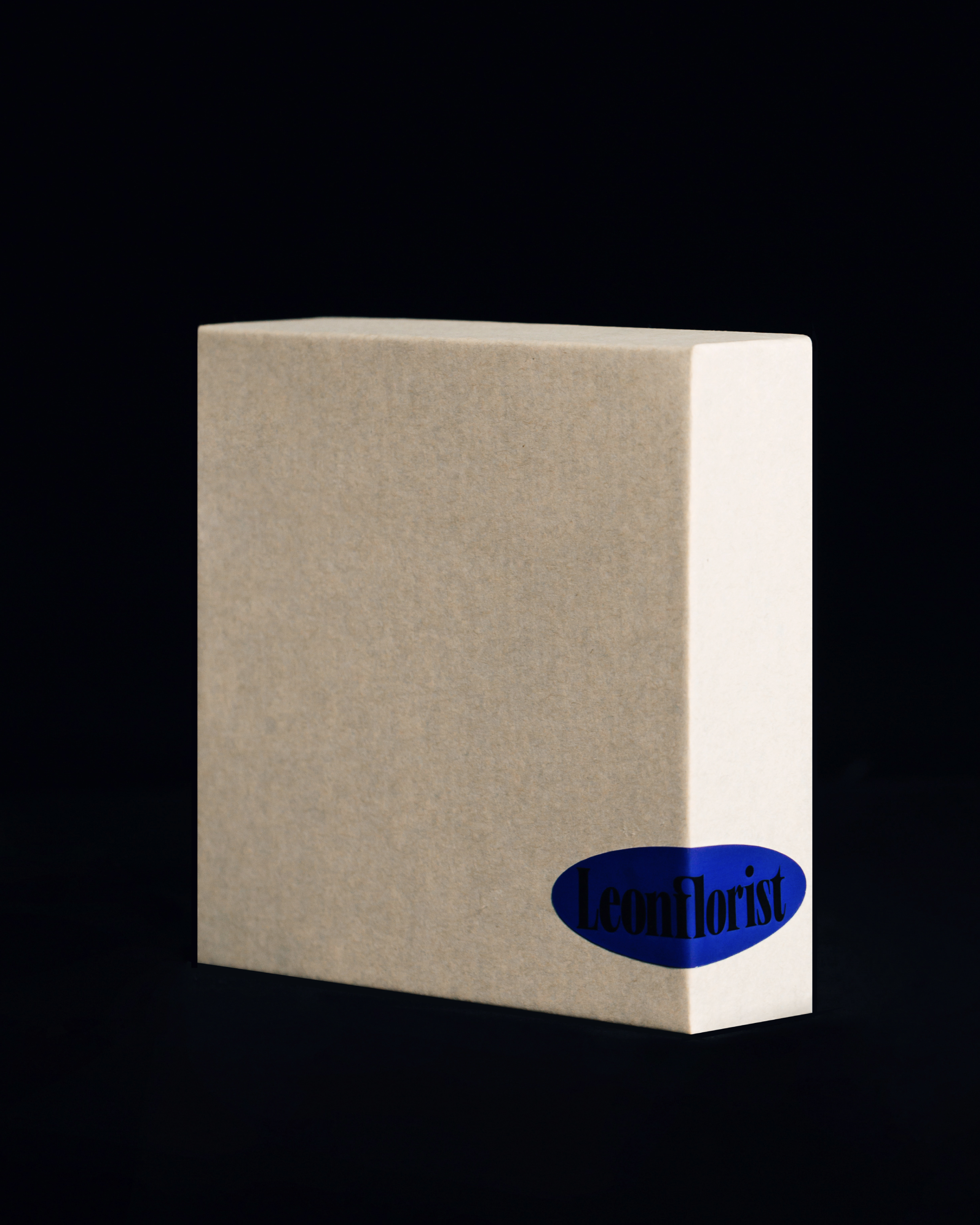
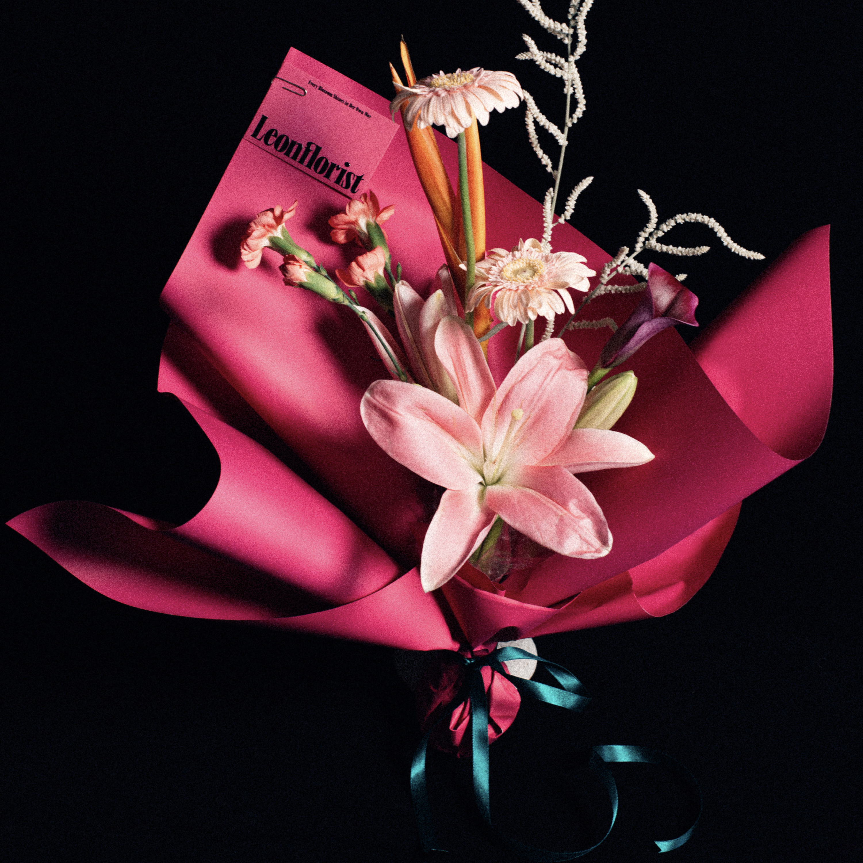
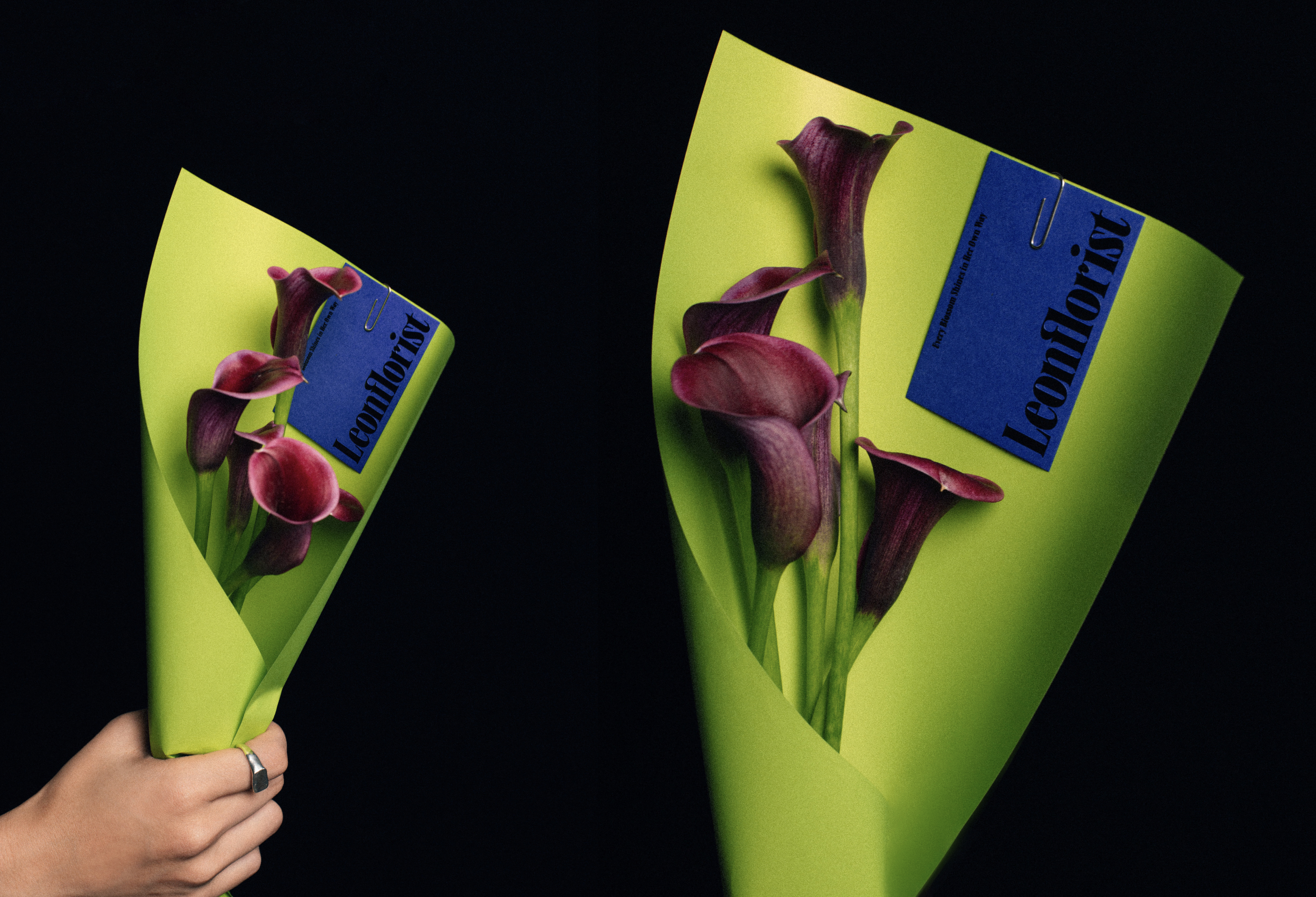
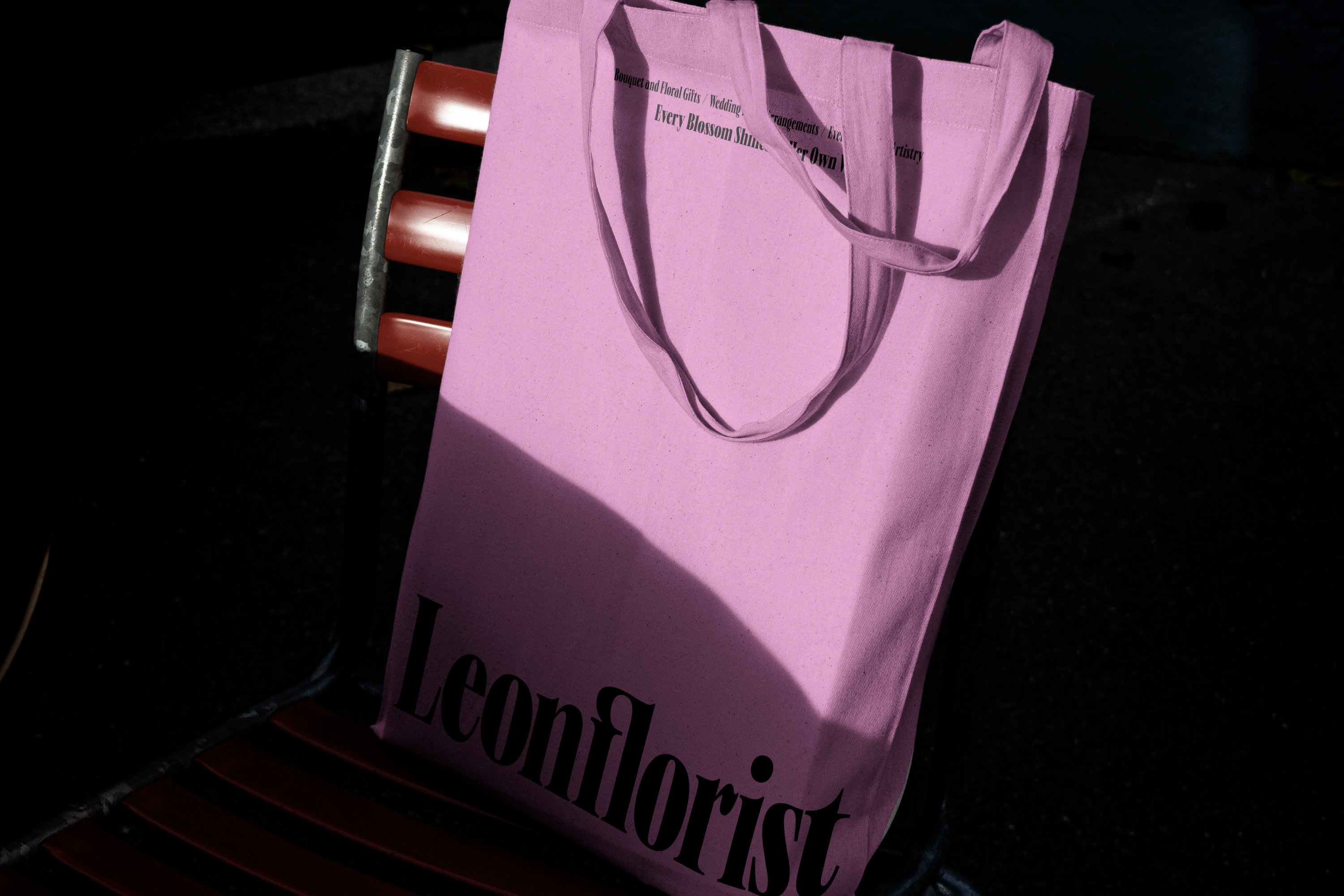
Leon Florist
AD:Liang Chu Ching Chang Ying Sin
D:Liang Chu Ching
P:Lee Tsung Yu
PM:Chang Ying Sin
CL:Leon Florist
Year:2024
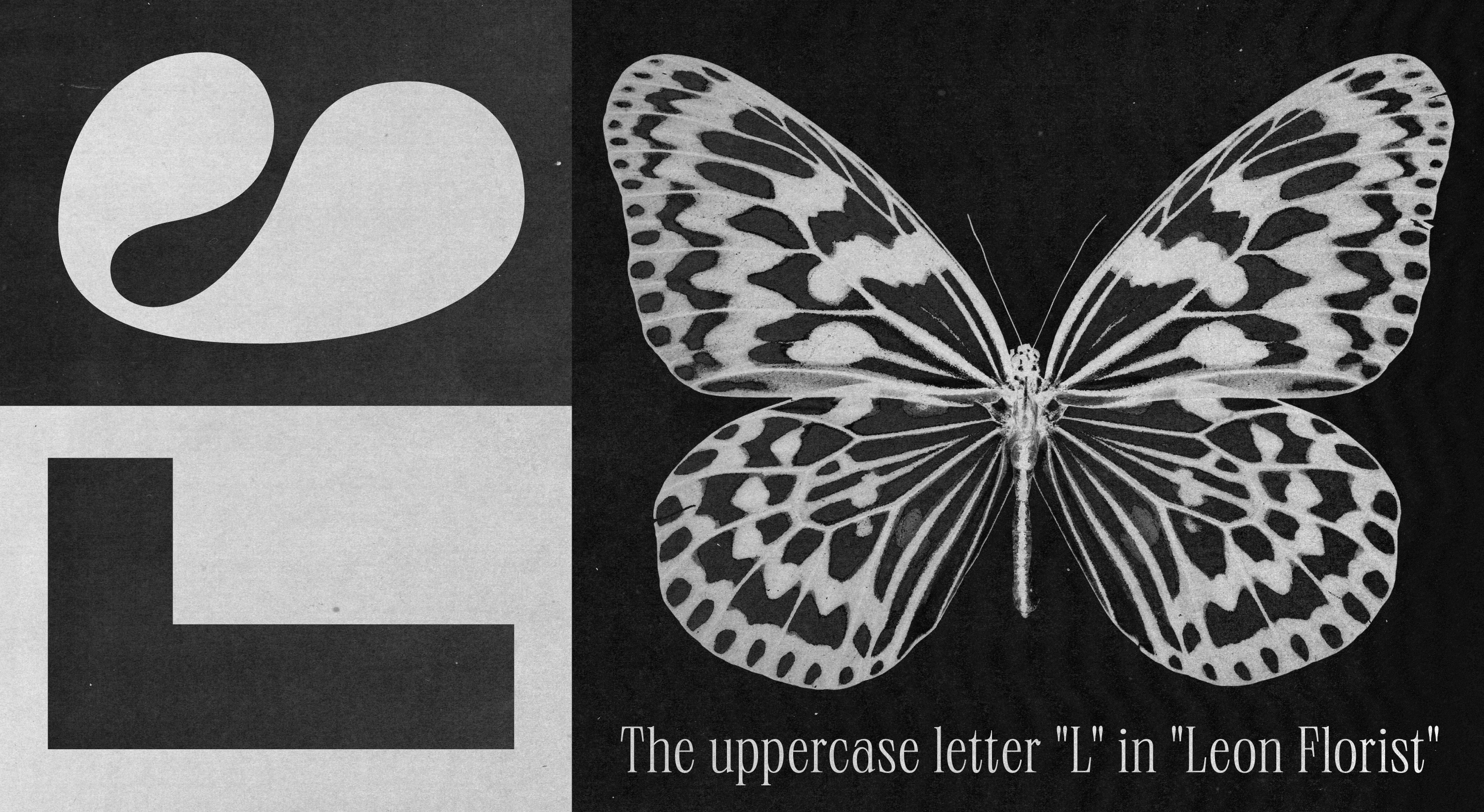
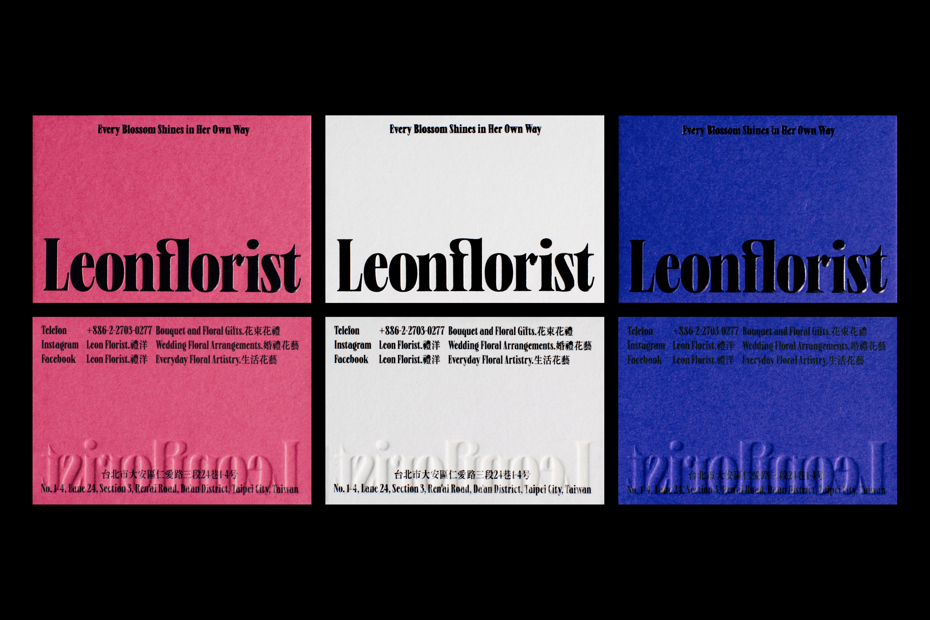
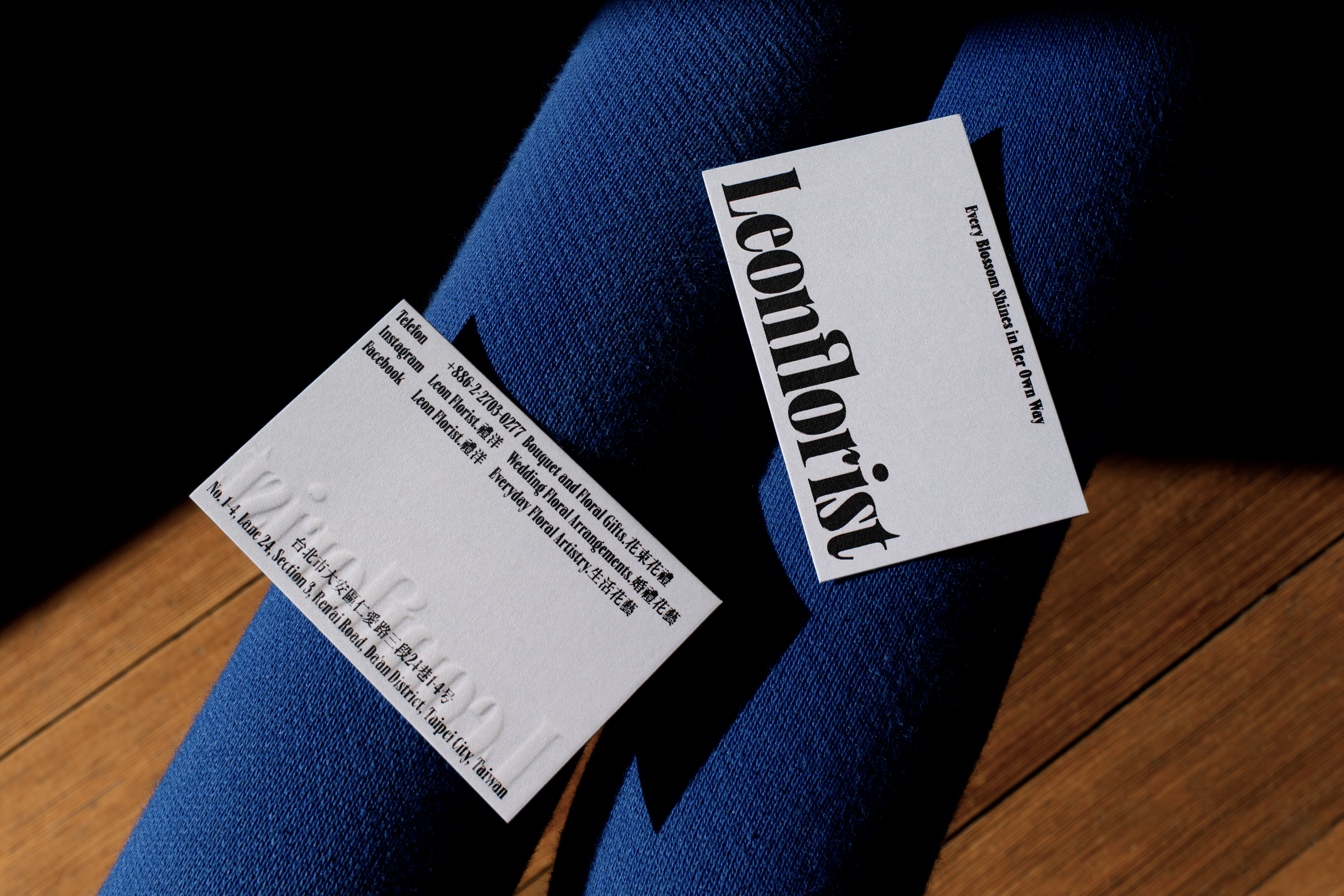
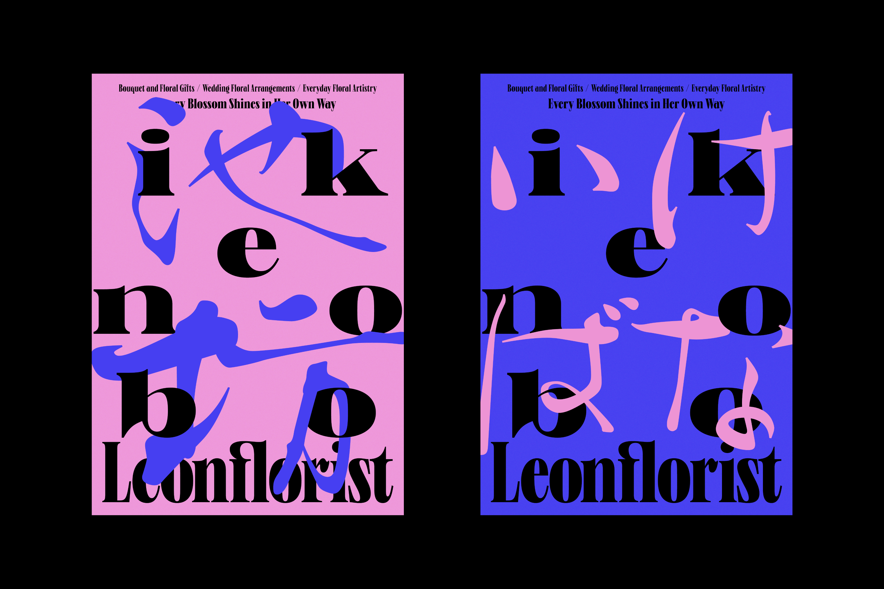
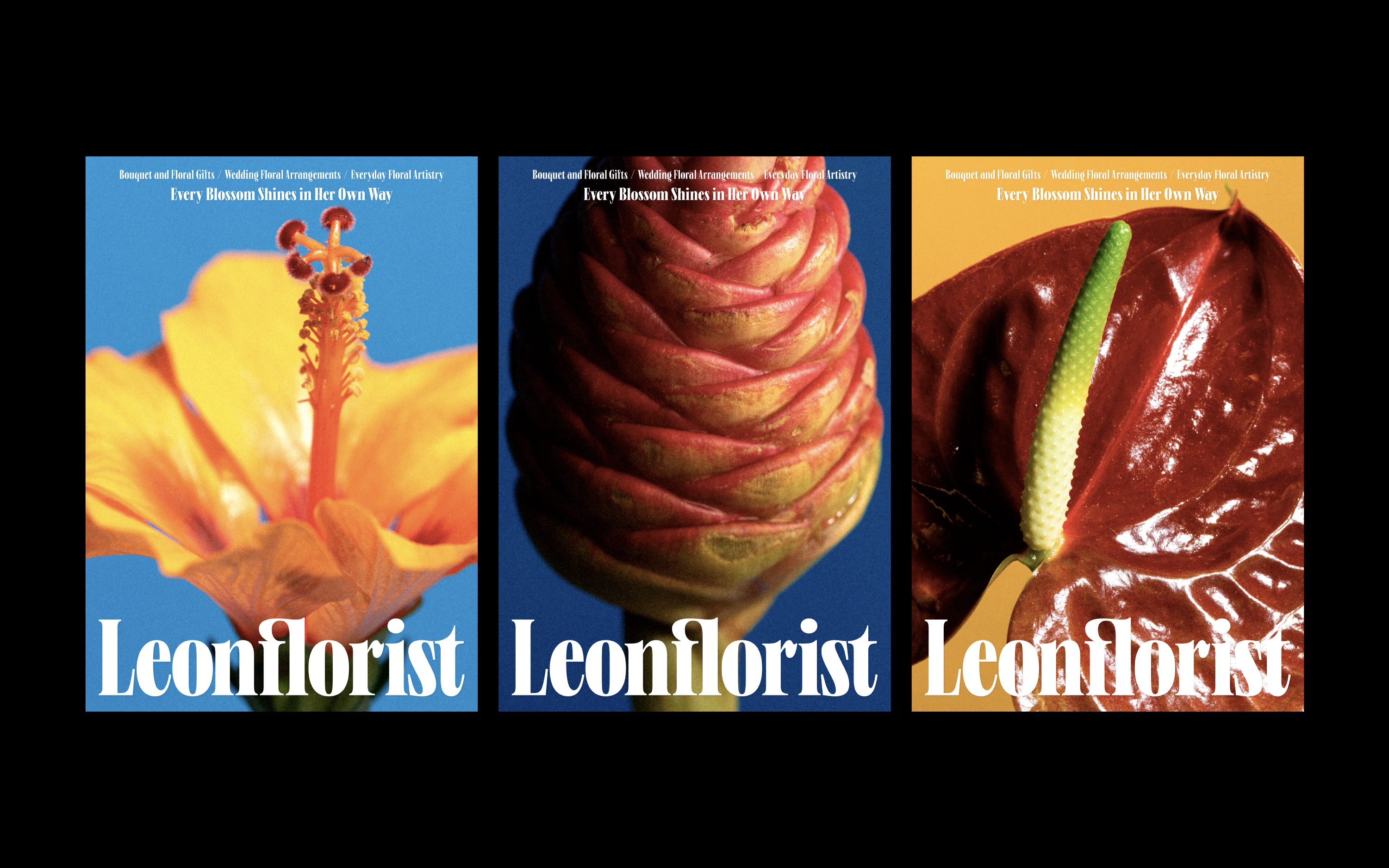
從品牌首字母「L」出發,以圓潤筆觸描繪萌芽瞬間,象徵品牌由花藝延伸至生活想像。
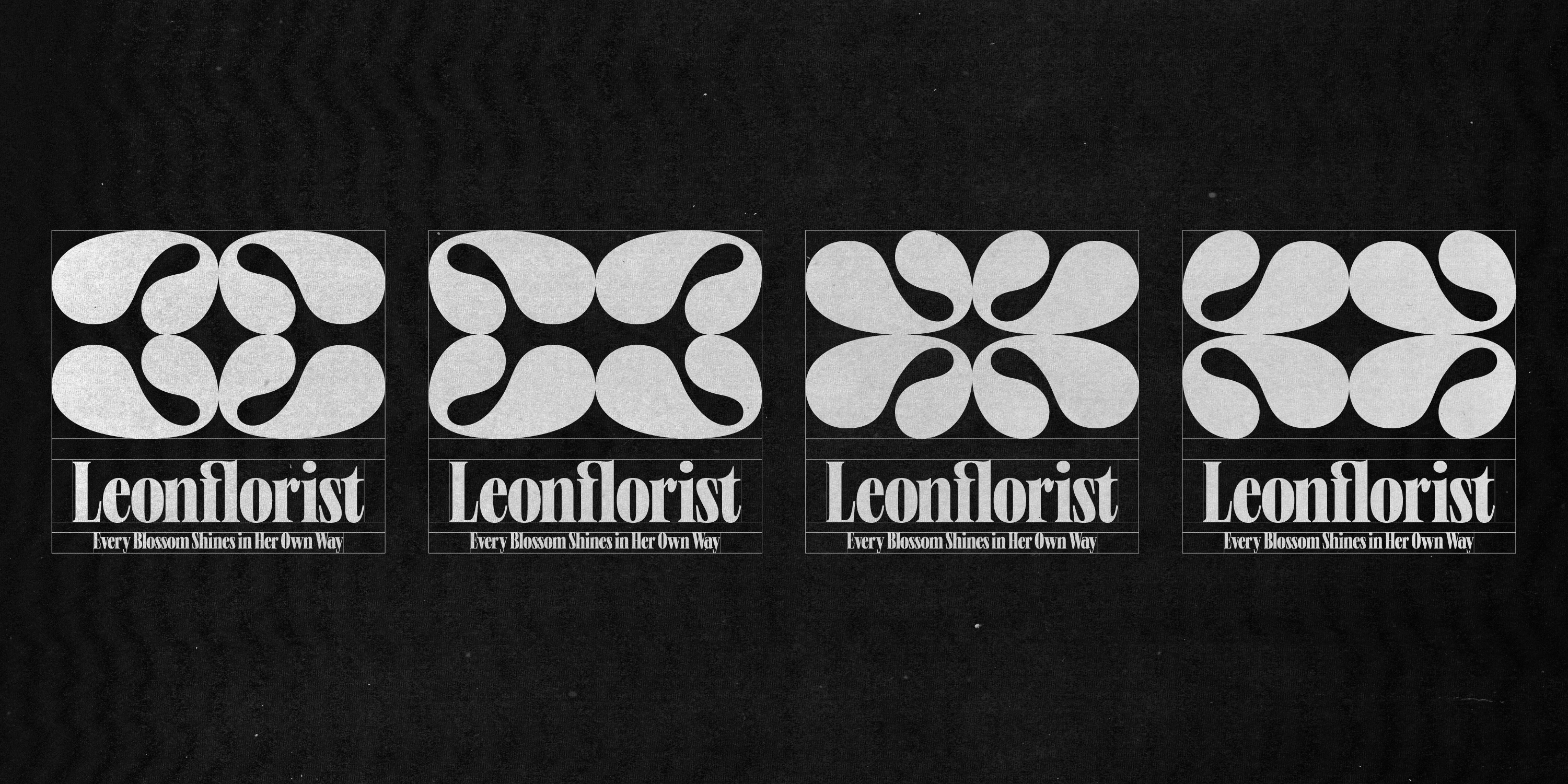
字體厚實如莖幹,穩定向上、富有節奏,展現品牌的生命力與感性。輔助圖形取自植物對稱的生長律動,靈活展現於各種應用中,成為調皮又鮮活的視覺記憶點。
整體識別如同會呼吸的植物——對稱、有節奏、也帶著自由的玩心;在保留花藝職人精神之餘,引導品牌向更開放、多元的方向生長。
Starting from the initial “L”, Leon’s identity uses soft strokes to capture the moment of growth, symbolizing its evolution from floral art to lifestyle imagination.
The typography stands firm like a plant’s stem—steady, rhythmic, and full of life. Graphic elements inspired by botanical symmetry appear playfully across applications, forming vivid visual memories.
The identity feels like a living plant—balanced, rhythmic, and free-spirited—preserving the craftsmanship of floral art while growing toward openness and diversity.